While visual appeal is important, a truly effective user interface (UI) goes much deeper. It’s about creating a seamless and enjoyable shopping experience that drives conversions and boosts customer satisfaction. A well-designed UI builds trust and makes it easy for users to find what they need, leading to a smoother checkout process and a more satisfying purchase. Salesforce Commerce Cloud provides the platform and tools necessary to build an ideal path to purchase, offering the control and customization needed for a truly engaging UI. Let’s explore a few key UI elements that make this possible.
The Importance of First Impressions
Before we dive into specific UI elements, let’s talk about the power of first impressions—because they really matter. Did you know it takes 50 milliseconds (that’s just 0.05 seconds!) for someone to form an opinion about your website? (Source) And those first impressions stick:
- 57% of users won’t recommend a business with a poorly designed website (especially on mobile) (Source)
- 88% of users are less likely to return after a bad experience. (Source)
- Design influences 94% of first impressions. (Source)
These numbers clearly demonstrate just how vital design and aesthetics are to your e-commerce success.
Why are Branding & Imagery relevant?
Let’s talk about making your site visually stunning and trustworthy through branding and imagery. Salesforce Commerce Cloud offers powerful image optimization and personalization tools to ensure your e-commerce site shines. Here are some best practices to consider as you create your on-site experience:
- Image Quality:
- Use sharp, high-resolution images (WebP, PNGs or optimized JPEGs for speed) and captivating visuals, especially in your hero section.
- Keep text overlays legible, not distracting.
- Consistency:
- Maintain uniform product image dimensions with consistent aspect ratios.
- Crop images to reveal the focal point and highlight the product’s key features. You can leverage the Salesforce Commerce Cloud tool, Page Designer for this.
- Use brand-aligned colors across all images to ensure a cohesive color palette
- Showcase Products:
- Feature products in real-life settings, showing them in use.
- Offer zoom capabilities and consider multiple angles, 360° views, or even short video clips for extra engagement.
- Use a clean background (white or light gray often works best) and negative space to avoid clutter.
- Brand Connection:
- Develop a distinctive editing style (consistent filters, lighting)
- Use story-driven images to create an emotional connection with your audience.
- Feature diverse demographics for greater relatability.
- Rotate images based on seasons and themes.
- Salesforce Commerce Cloud’s Personalization AI can adjust visuals based on user behavior.
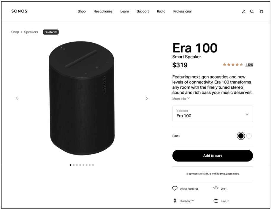
Sonos.com utilizes high-resolution, high-quality images with ample negative white space, reflecting the brand’s sophisticated aesthetic and uncluttered design.
With tools like Page Designer, AI-powered recommendations, a robust CMS, and Personalization AI in Salesforce Commerce Cloud, you can easily manage and optimize your imagery, ensuring your site is visually compelling, on-brand, and drives conversions.
For a fun UI exercise, we took a look at Sonos.com and did a UX assessment, pointing out both the strong design choices, and areas for improvement. You can read more about it here.
CTAs & Tone
Your Calls to Action (CTAs) are like little guides on your website, so placement and tone are crucial. Think of your CTA tone as an extension of your brand’s voice—it should feel consistent and natural. Here are some considerations:
- Clarity is King:
- Use action-oriented verbs that tell users exactly what happens when they click (think “Shop Now” or “Add to Cart”).
- Keep it short and sweet—no long sentences needed!
- Stand Out Strong:
- Make your CTAs pop! Use contrasting colors, clear fonts, and sufficient padding so they’re easy to see.
- Strategic Placement:
- Put CTAs where they make the most sense in the customer journey—near product descriptions, above the fold, and wherever they guide the user toward a purchase.
- Consider a sticky “Buy Now” button for constant access, eliminating the need for users to scroll back.
- Keep the style consistent across your site.
- Brand Voice:
- Let your brand’s personality shine through! Whether it’s playful, professional, or urgent, your CTAs should reflect that.
- Urgency (Use Sparingly):
- Words like “Now” or “Limited Time” can create a sense of urgency, but use them wisely.
- Highlight Benefits:
- If you can, add a little extra incentive, like “Get Your Free Gift!”
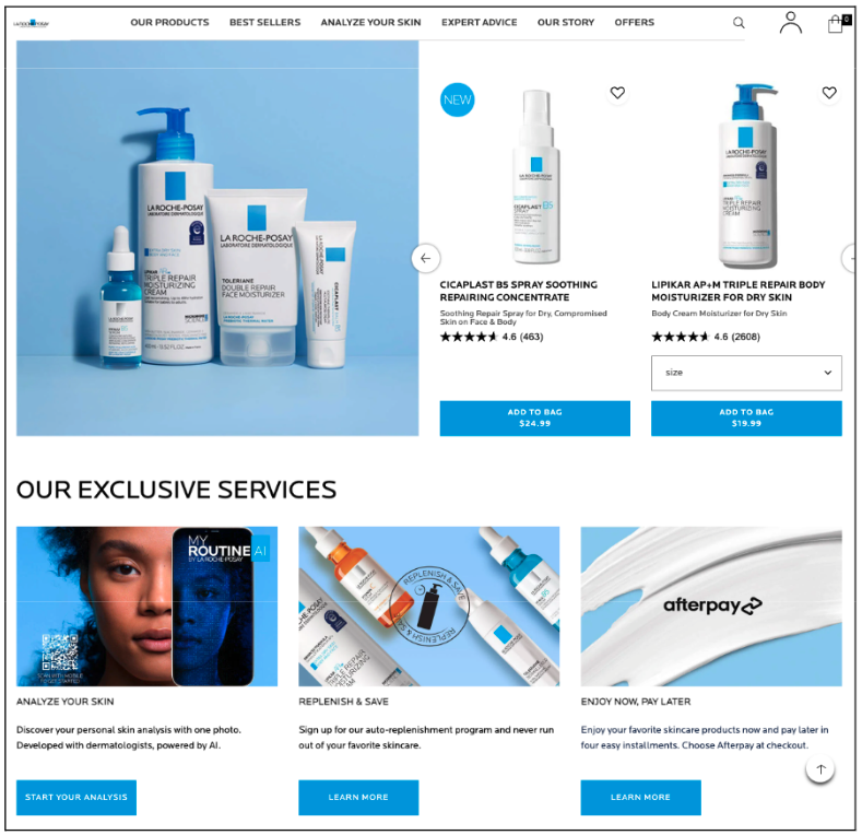
Laroche-posay.us features bold, action-oriented CTAs that stand out and drive engagement.
The Importance of Search in the e-commerce experience
Search is key to a great e-commerce experience—it’s how most people find what they’re looking for (50% actually prefer search over navigation). That’s why your search bar needs to be prominent and easy to use. Here are a few quick tips:
- Placement:
- Top/Centre of the page —it’s where users expect it.
- Keep it visible above the fold, especially on mobile, and consider a sticky search bar for scrolling.
- Size & Visibility:
- Make it wide enough for long queries (around 27-30 characters) and include clear placeholder text (e.g., “Search for products, brands, or categories…”).
- Ensure high contrast with the background colour
- Design:
- Rounded corners can give a modern feel.
- Ensure consistent spacing around so it aligns well with other header elements for visual balance
- Use the magnifying glass icon
- Functionality:
- Consider a click-to-expand approach to reveal more related search info for an enhanced search experience (see yeti.com example below)
- Implement smart search functionality to catch and correct typos
- Show results dynamically as the user types
Of course, there are many more Salesforce Commerce Cloud search functionalities that enhance user experience through Einstein AI, from AI-powered personalization to voice search—but that’s a topic for another blog. Stay tuned!
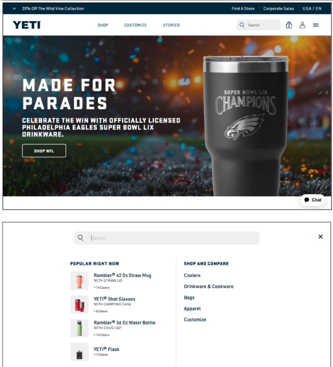
Yeti.com provides an interactive search experience, where clicking reveals a rich search interface with images, predictive text, popular product suggestions, and comparison features, effectively minimizing distractions.
In the competitive world of e-commerce, a strong UI isn’t just a nice-to-have; it’s a business necessity. By implementing these UI best practices within Salesforce Commerce Cloud, you’re not simply improving the look and feel of your site—you’re investing in a seamless customer journey that drives conversions, boosts customer lifetime value, and ultimately delivers a significant return on your investment.
Interested in learning more? We’re here to help. Contact us to learn more about Salesforce Commerce Cloud and how we can tailor a solution for your business.